
HAHA! Right on!
Can we make a poll on the new logo?
1 Like
The PRV community is actually great.
I’m reading all the suggestions on this thread and I’m enjoying all of it 
5 Likes
Please, can we use the blue one, gahh!!!
5 Likes
The blue one reminds me more like a brand of perfumes
2 Likes
The blue one has the coloring of the legacy brand that 51% of us want to keep that voted.
It also has the eclipsing effect that the dev team wants.
Win, win.
2 Likes
These just sketches. I don’t have a license for the eclipse image.
This is from freepik.com
You can export these from here.
1 Like
Just trying to get ahead of the curve on this one
Not political
I’m sure not everyone is following American cultural issues, but the George Floyd story plus the riots etc is probably going to be newsworthy for a while and I stumbled upon this because I follow philly basketball (go Sixers)!

Ben Simmons made his twitter icon pic a black circle, I’m assuming it’s a reference to George Floyd being silenced. If this in anyway starts a trend, black circles might be relatively common making our black circle, less noticeable… Might be worth being prepared with another option just in case that starts trending.
All that being said, let’s everyone give a little bit of credit to the incognito team for an innovative idea that may have been stolen by an nba star! Haha
6 Likes
So I am aware the logo was changed in May to a completely black logo.
Personally I do not think this is good because new users get confused by this. I got confused when I saw it but also someone else I introduced to incognito had the same experience. It also doesn’t really make it look memorable.
However, this argument has been brought up in the forum several times before and the core team didn’t feel the need to change the logo for this reason and that’s all fine.
However… I have another argument against this logo and I was wondering if the core team has thought of this. It has to do with trademarks. Now, my knowledge of law doesn’t go far beyond the European Union law, but I assume trademark law isn’t much different outside of the EU. And as a company with a logo (trademark) you would want to register this in the EU and other countries eventually anyways.
The main reason for this is if Incognito becomes big you do NOT want the situation where people could just make clones of incognito (or phishing attempts) for example or for whatever other reason use the incognito logo. When a trademark is registered it is easier to take down projects/websites that use the logo.
The problem with the black logo however is that according to (at least) EU trademark law, just a colour (and probably also just a colour in a circle) is in almost all cases not eligible for registering as a trademark. The reason for this is that it wouldn’t have enough of a distinctive character. The only way a colour can be registered is when people really link a company with that specific colour. So in this case it would mean that if you ask the average person on the street to say something about the colour black and show them this logo, they would say “ah yeah that’s incognito”.
My question is, has this problem been considered when changing the logo?
8 Likes
Side note on the all-black logo. I have a black trim on my phone theme, meaning the outside top notification area is black. All apps that notify me to show up fine, but I can’t see the incognito notifications, it just looks like a blank space.
Kudos on the perfect black color selection. I’m not even mad.
4 Likes
Those are some very good points indeed. When I first saw that it was just a black circle I thought it was cool because of how “Incognito” it’s trying to be with the perfectly blank and unassuming logo but you’re definitely right about memorability and potential copycats.
I might suggest keeping the stark black circle as the outline and doing something minimalistic inside the circle? I mean the classic character with hat for the incognito logo is cool but in order for it to remain under the radar it would have to be in a very subtle grey perhaps. Or even just the letters PRV within the circle? There’s definitely a lot of different ways to keep the anonymous feel while keeping the logo different and distinguished.
2 Likes
The logo should consist of either
Or
This would take care of the logo issue and mascot issue in my opinion.
I’m having a few logos commissioned to give an example, will be done in a few days.
1 Like
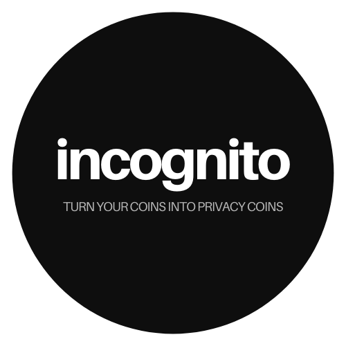
I think it is also important to add something like “turn your coins into privacy coins”. At the moment we are small = no one knows us. So when people see just the name, they have no idea what it is about.
Another thing might be the name in general it is quite generic. On long term this might be not the best for brand awareness. What do you think guys according the name?
3 Likes

5 Likes

4 Likes
Just my opinion, but most of these are uncreative and very low quality options and the current logo is, to me very lazy. 

These are just sample works, but they are originally made for incognito. I picked the Mimic Octopus because it is noteworthy for being able to impersonate a wide variety of other marine animals. I think the bar has to be higher than it currently is, this is all my opinion of course and if you disagree that’s completely fine.
4 Likes
I haven’t seen the idea of incorporating a shield into the logo. In my mind the shield represents protection. Since the mission of Incognito is to protect the world from surveillance and control, why not start with a shield? I put together a quick sketch…apologies for not being an artist.

8 Likes
I like this shield idea and the direction that a shield would take us in. I’ve just looked through this whole chat and hope to come up with a few rough ideas rn we’ll see how it goes.
Hmmm I like the idea of those different animals as a symbol, but for the octopus one I gotta say in my opinion it seems too similar to the logo from Sentivate. https://sentivate.com/ Their logo is ■■■■■■■ sick lol
I think the whole idea of the incognito logo, from my perspective at least from the versions i’ve witnessed so far, is for the logo to be very very minimalistic. For the purpose that “even the logo is incognito, it goes under the radar.” Those coin designs you have are dope, but i feel they are too flashy for the incognito feel.
I sometimes call myself an artist, but i only do photo manipulation related stuff so i cant create original designs generally speaking. but in my opinion something that combines the minimalistic feel of the plain dark circle, the letters PRV (instead of “Incognito” because that word in itself is too vague and isn’t specific enough to the project - ie search PRV and then search incognito and which one pops up etc), AND the old dark blue incognito figure that appears almost in the shadows.
If someone could maybe incorporate the letters PRV into the previous design of the incognito dude with the hat, then I think that might be the best of all worlds. It will be minimal, have some distinguishable text, have a “character” (in terms of the dude with the hat), and it will seem to satisfy those who liked the old logo and those who wish to see something newer and more original.
- Like maybe the upper circle section of the P could be the dude’s right eye glass, with the line for the P being incorporated somehow into the outline of his face or a contour line.
- The R could be somehow incorporated into the characters nose like a > type style nose for the round part of the R, and the leg of the R (the part that leans to the viewers right) could be like a line under his nose as a sort of philtrum.
- And the V- - i am way too tired for the V for words rn lol.
I know these are going to look ugly as hell, but just rough ideas and if somebody who actually knows what they’re doing could do some sort of a spin it might be a viable option?

I like the idea of the PRV symbol within the hat somehow. and as for the glasses/eyes, considering it is the Incognito chain why not try to incorporate some sort of chain somewhere? I made this white because I’m crazy no other reason lol than to distinguish it from the letters at the top really. Maybe even like just doing a circle with the word INCOGNITO but trying to incorporate some style of chain within the layout of the letters?
Hmm I really cant think of much more than that rn and I know it probably looked shmammered because I’m tired as a muf*cka.
I would say in terms of the style that I’m feeling personally, this designer on instagram captures pretty well. The way they combine the meaning of the words within the image for the logo itself is what I think the logo should strive for. Like the ones for Ping Pong Ice Cream, Radish, Elephant Records, FireworkFilms, and The Third Child even look really cool and like a Incognito/PRV spin would be very fitting in my opinion. Sorry for the ramble here yall! xD