Concept Art UI/UX for a unified incognito experience.

incognito-Black-phone
Hello, I am officially joining the community and offering my services. Because of the nature of what I do I may be more of a consultant helping to amplify other projects then see any from start to finish. In my day job I am a Sr concept artist at a game studio, I do two things:

  1. Concept art to get the juices flowing for development.
  2. Visually polish the final result or “up-plus/plus-up” everything in a final overview tightening anything that doesn’t feel right. After a few layer passes back back & fourth we ship.

Objective

Help developers create a unified, fluid, beautiful experience across the incognito ecosystem.

  • Take in-development projects an provide artistic direction
  • streamline the flow of features, and organize content and functionality so incognito feels effortless and even fun to use
  • give ideas to up-plus existing projects
  • Work with designers as a resource to bounce ideas off of as another set of eyes.
  • Create unified design languages and assets that bridge platforms and media.

Length

Individual tasks will very
Any single concept template like I did for the phone app takes between two weeks to a month.

Consulting and troubleshooting will be taken care of in meetings or coraspondance over a couple days.

Key Results

These will look like single, or sets of near promo level images that convey color pallet, style, layout concepts, mechanical concepts, animation, and flow of functionality. Overall look and feel. In addition, followup consulting and discussions to help developers with execution.
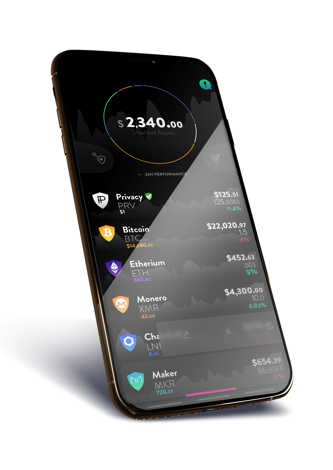
Phone app Concept - built.
Web app?
Exchange?
YouTube splash intros?

Note

If you want my help on your project, contact me with screenshots or samples of what your building, or talk to me about what you desire to build, I here to help.

My gallery.

Sample work ui/ux:

incognito-Black-phone|1122x1585, 50%
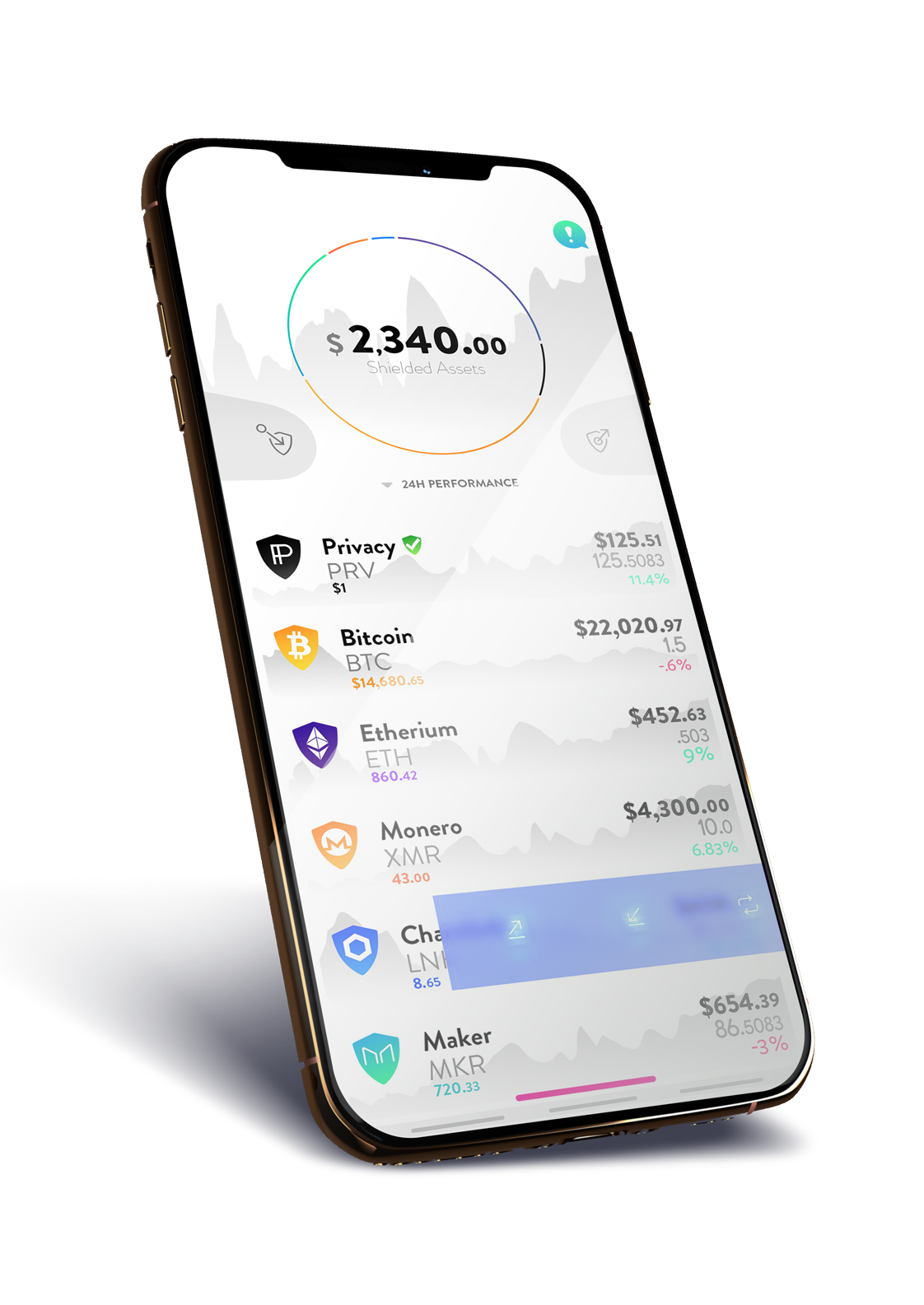
 incognito-White-phone


Aarons-Oh-Snap-phonesm Coraldocs-phone !

16 Likes

Love it man. Absolutely love it. Great initiative and really nice style. The only thing I would add would be an option in the settings menu regarding which pieces of information the user wants to see on that main homescreen involving the different coins listed on the bottom and the circular representation of the portfolio on top.

I would love to see the ability to move those items around and possibly even go as far as an option of only having the # amount of coins/token being shown. Oh boom you could even do like a ‘premium’ vs ‘basic’ membership option ting for the app potentially. With the basic membership it’s free and you only get to see how many coins of each asset you have, the price of the current asset, and the overall price of how many of each asset you own. The premium membership would be a 5PRV charge per month (taken out of liquidity rewards or something, for example) and it would have the option of really customizing the whole visual interface. I dunno I’m tired af so just throwing whatever idea came into my head while I was typing hahah.

But the visual appeal here is really top notch. It looks like another level for Incognito and if this were to be adopted, I also put my vote in that you help with updating/changing the logo!! Even something as simple as a little black shield like you have for the shielding/unshielding buttons and just have the letters ‘in’ on the shield somehow as to portray the letters going inside the shield to become incognito. I dunno again just throwing things around, unfiltered, stream of consciousness style. Great work so far and I look forward to seeing what comes of it! :smiley:

4 Likes

Copied from another thread so all my work can be found in one place

I do love the idea of a blank icon. I love the mimic octopus idea also, and shield.

I hear the argument for a logo needing to tell a story, frame a narrative.
So I have some submissions

We NEED our logo to have an outline of a shield. because shielding is so important and draws attention to the narrative “We are protecting/We have something to protect” (as opposed haveing something to hide.)

A Pure black shield is fine by me, but the emblem of a peering eye with a strike though it emphasizes that the shield is specifically against eyes.

a horizontal eye gives a direct feeling.
slanted is sexier and more dynamic
vertical is very interesting and unique. I checked my favorite.
Incognito-logo

1 Like

Here is my contribution so far to the incognito Polish. I have made several dozen custom icons. Each with a custom gradient treatment.

PRV-Eye PRV-Eye-White PRV
Incognitos PRV I gave a couple of options, th IP and the No-Eye.

I am sure there will be a better way to export these. Programmatically masking either a Shield for shielded Cryptos or round circle mask for unshielded coins. and pull icon and gradient info from web scrappers.

But for now I would love to see if someone could use these. Enjoy.
AAVE ADA Artboard-19 ATOM BAND BAT bnb BTC COMP CRO DAI DOGE DOT EOS ETH EWT LINK LTC MKR NEO PRV-Eye-White REN RSR RVN USDC USDT VET XLM XMR XRP XTZ

6 Likes

The idea for new UI UX is really cool but not simple/clean enough for user friendly, i think so

1 Like

Welcome to the incognito community! Do you have any suggestions?

really like it, nice design, look clean and full information for me. Anyway, the cluster is a little bit messy and too colorful, prefer the one above