Sexy New UI/UX Concept Design Idea!

incognito-Black-phone


I Love Incognito and I have some ideas for the look and feel of the app. I want to first say that I think the wallet already is looking good so I dont want to step on any toes. I did however want to take all the best parts from other wallets and apps I have used and put the best ideas forward. I am a novice programmer, so I cant help too much on that end. However, I have tried to implement the best from Incognito with what I like from robinhood, webull, coins, cashapp, and above all Exodus wallet (they have some of the slickest transition animations and effortless flow I have seen!) I have played with about 20 wallets apps and I want Incognito to be hands down the best. I hope this helps.

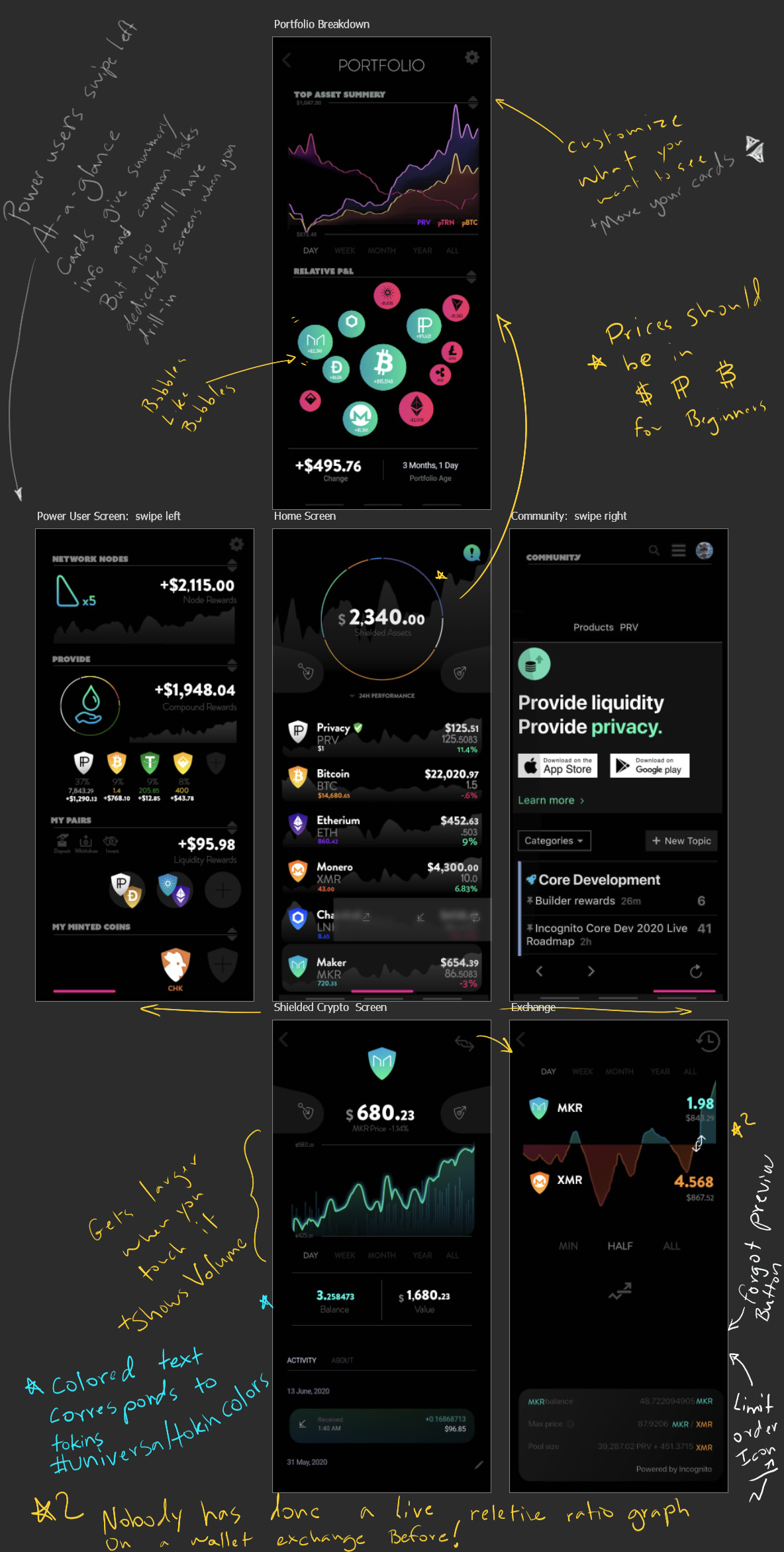
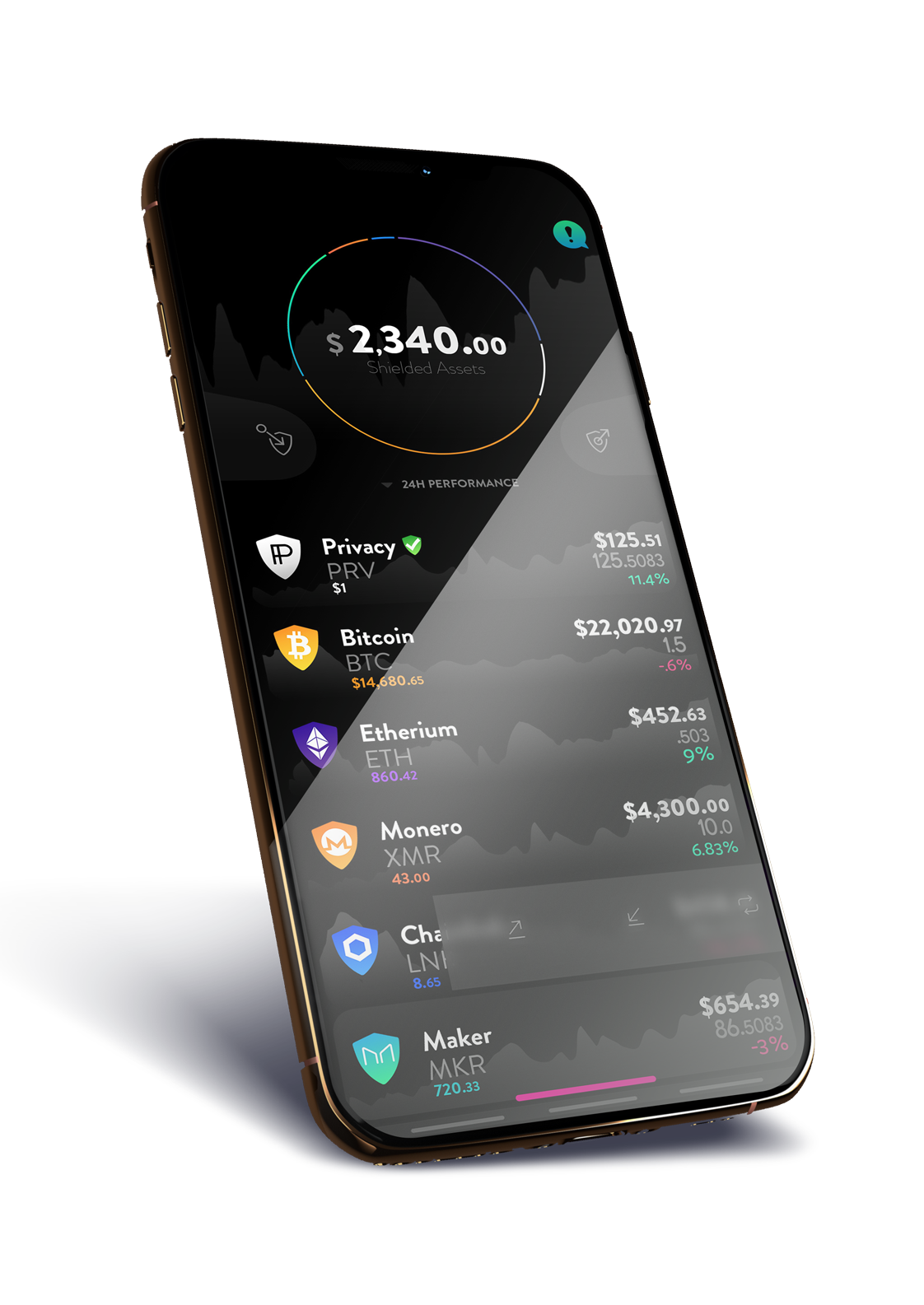
The Home Screen will give the user a good idea of what is happening with there portfolio with subtle rolling performance graphics and a breakdown of there assets. They should be able to sort by gains, portfolio size, alphabetical, and market cap.

I have made the shield a motif to always remind the user that they are being protected. I also made a shield & un-shield icons.

The App should open up to the wallet first and foremost as this will give beginners everything they need. Advanced users and Social Users need only swipe left and right respectively.

Beginners need to understand gains. While i am not against IP values by default, $ would help novices and the masses who are not used to using other currencies see the value of crypto and its gains vs Fiat. BTC should be a toggleable option also.

Clicking on any asset will take you to its corresponding crypto screen. However if you click its shield icon it will have a frosted rollout to quickly send and receive.


In the wallet You see the cryptos price performance on a chart subtly with volume info. Dragging your finger across it will show you info at that point. Transaction history, and an about tab where you can read its whitepaper if provided.

Each crypto will have a pallet derived from its icon colors. This will create a color language that is app wide consistent. The colors will be used for its line, all external mentions of the asset, all numbers associated with its own network.

From the upper right corner you can trade.


Exchange This is the slickest wallet exchange ever. When I use it I can easily see if I am trading at a historically low ratio on the network.

I also made a limit order icon.

I forgot the preview exchange button, but the one we have now is just fine.

The Power User only need swipe right to see all the most important data and do the most common tasks. They get the treat of seeing how much currency they have made in all sorts of ways. --the more the better!

The info is sorted onto cards that can be dragged up or down to suit the users use-case.

The Community is only a swipe l=right from the home screen. Everything should feel very connected that way.


Portfolio Performance
From the home screen, if you tap the circle it will bring up a screen which we can put any analytics or useful information that helps the user understand what has been going on in their portfolio better.

These would be on cards so the most useful can be moved to the top.
Here is the layout with some of my notes.

38 Likes

I just realized how dark the price charts look on my phone. I would make them a bit lighter then that so you can see price action.

2 Likes

I like this a lot! Great work on this.

2 Likes

Thank you. I spent quite a bit of time on it for one big post. What are the parts/ features you most enjoy?

5 Likes

This is fantastic!

3 Likes

This is a beautiful UI/UX

2 Likes

Light Mode is finished! Hopefully the Price charts are more visible.
I still need to tinker with dark mode so you can see what is better going on. I underestimated how wonderful my work screens contrast is.


Most desirous features of the home screen for me are price charts and buy/sell/trade directly from the home screen.


Many wallets have price charts. Few have volume, even fewer have candle options. Even fewer have the ability to set limit buy orders on the chart itself.


Relative Price exchange graph like this is my number one wish!


Hopefully the add pair and add coin icons are more visible now in this update.

Chicken Coin should be big and should be exchangeable for poppers.


The top asset summary graph is not exactly how I imagined it functionally. I would like to see a chart where you can see when assets are brought in, expand, contract and go somewhat more like the following graph.
content_Screen_Shot_2017-08-10_at_2.48.52_PM 51
-just less boring looking. Grey lines instead of harsh black, denser sample rate etc.

Please let me know what you think and ideas. Tips are always appreciated. I will be posting updates as well as comparing competing UI’s and pros and cons of design choices.

Blessings.

14 Likes

Your vision is astounding👏

3 Likes

Gorgeous!

(Btw… when you go into edit your post you can select the % size for images on the right side in the Preview area, and set them to 75% or 50% so its easier to scroll through and see the images in your post. Right now they are so big that its hard to take it all in.)

4 Likes

THANK YOU!! I was wondering why it was showing so weird. Everything is fixed now.

3 Likes

OMG! This is exactly the sort of look I had in my head when I posted about a better looking app a few weeks ago! I love this and I certainly hope @andrey and the team takes note and makes the app look and feel as sexy as this is. I really love the default dark mode and the colors.

Well done @JoyRaptor!!! :clap:t2: :clap:t2: :clap:t2:

6 Likes

Wow, looks really cool. More detail but somehow looks cleaner. Good stuff.

2 Likes

I really like your form language too… The concept of showing coins as shields or circles could really help to differentiate the two types of transfer and help reinforce concepts…

When the coin is shown as a shield, you would know it is a pCoin, when it is a circle, it is unprotected… I could see this help people see the difference between sending assets between users in network, compared to sending them to someone out of network. If you could work that form language into the two different actions taken in the app, I think it would make it even stronger.

7 Likes

Just fyi. You misspelled Ethereum.

1 Like

Wow, slick. Looks fantastic.

Just FYI - ‘Summary’ is correct spelling :wink:

Can’t wait for this to be in an app update. Next step… add UI/UX to desktop app project? :smiley:

1 Like

Thanks folks for the editing help. Spelling is something I am improving.

Form language and color language should help beginners. Again let me know what bits you like the most or if there’s stuff that would be best reverted or improved.

1 Like

Hey @JoyRaptor it’s awesome input!

I like the idea of total shielded assets and shield style icons, it gives me some confidence that it’s safe )

Do you know that there is quite a lot of development is going on around wallets those days ?

It could be a potentially good start of something big if you guys find collaboration opportunities and build your own products on top of the chain.

From this point of view, we want you guys to have ownership of the projects you contribute )

We just started Builder rewards 2 months ago to incentivize this kind of initiative.

9 Likes

Hey @JoyRaptor, your idea is really cool! Why don’t you join in Builder rewards program?! It’s specially designed for those who are much contributing to the project by their own amazing products!

As what @andrey suggests, you can take an ownership of your sexy wallet, or do the collaboration with other builders who are on the way building different version of wallets. It’s up to you. But…let’s join!

Any question, ping me :slight_smile: Happy to help you get on-board!

5 Likes

Thanks Ducky and Andrey! I think what you guys have been doing is exceptional and timely more then people know. I am most excited about the phone app because that’s what I use every day for everything. Was hoping I could get in on that.

I will figure out how to apply for builder rewards. I dont really do code but if there is a programmer who likes the vision and wants to help me implement it I can give/make assets?

I only gave only cursory attention to fonts, I am sure some of the dedicated Graphic designers can give the love to all those details.

As a concept artist I am good at big picture visions. I am good with color, lighting.
I am actually weaker when it comes to the finer points of graphic design.
I am not actually a graphic designer.
I am also weak at spelling haha.
I have been told I am strong in ux and interface in general. I think I am good at breaking things down for beginners and have good flow intuition.
I do have a full-time/overtime job, so I can do short all-nighters to get a vision and then answer questions throughout days, but I cant be on things daily.

I say all this so you can have a better idea of how to use me and who to point me towards.

And of course any lurking Programmers want to buddy up?

4 Likes

Lol! You’re funny! Thanks for giving a detailed profile though :joy:

Well, because most of current builders are focusing on building web wallet, while you’re interested in mobile app, I would recommend you to make a post in Wanted category and looking for a buddy from there. Hopefully a programmer will see and you guys can commence your collaboration. :crossed_fingers: :crossed_fingers:

Looking forward to see your sexy design come true!

3 Likes