I think the logo now is quite simple and not have anything special to show Incognito uniqueness
Can we make a poll on the new logo?
1 Like
LIGHTNING SHIELD.
If enough of us say it, it may become true 
1 Like
Have they made a decision yet? any reward for designing new logo?
Not sure how I feel about a shield, I made a design I the past with a shield, but the point @Reydiant made about it being common can be an issue. I still like the idea of a closed eye of some kind. The “unseeing eye”, I think it avoids being traditionally “protection”, but also doesn’t play into the “illegality” that people associate with crypto and anonymity.
The idea of the unseeing eye is opposite of the all seeing eye so it’s being anti Illuminati or protecting hiding from the “elite” because it’s elitists and the establishment that controls money.
IDK just the way I think about it haha
New update is available, but the logo is wholly black, they didn’t choose any of those designs
In fact, not the team started this discussion. They are revolutionary youngsters  If they like the current logo, my all support is with them.
Btw, welcome to the club 
1 Like
My mistake, I thought they created this topic, anw those designs look good, hope the team can cooperate and choose one to be our new logo
1 Like
It is heartwarming to see people so involved with the project and caring about the logo. As mentioned above, we are not looking for a new logo at the moemnt. This thread was created in reaction to changing our logo from the hat/glasses guy to the black dot, in May 2020.
We are open to suggestions on just about any detail of the project, and incorporated those that add to the project reaching its potential.
A new logo is not on the list, but who knows what the future will bring.
1 Like
For the wallet I am fine with a black dot (or a black shield). But my larger concern is we look cool on exchanges and coin marketcap, gecko etc. PRV needs to be a beckon on a hill for other privacy people. Something funny like a black silhouette of a light house just came to mind.
Is the core team thinking of doing just a black dot for those places with PRV?
1 Like
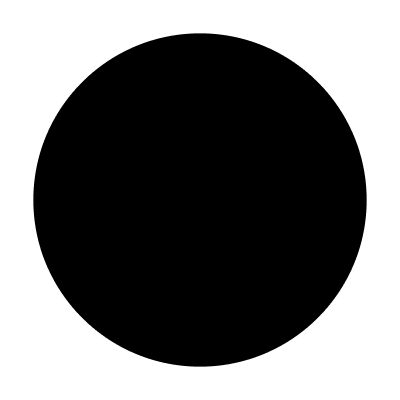
The black dot is the logo. That is what will be used wherever it is needed.
just a little bit confused, when we use the incognito mode on the phone or web browser, then it’s very hard to recognize our logo
1 Like
The black nothing logo is very easy to recognize and it stands out precisely because of its absence. Real privacy should disappear into the black without any identifying characteristics and as for the confusion it may cause to newcomers–all the better. Let the confusing and difficult task of achieving privacy in today’s technological society be the symbolic message of the logo. We shouldn’t want a PRIVACY BRAND to stand out. Privacy is valued for its ability to disappear into the background.
It remains to be seen whether the majority of the public in any culture want real privacy, because at least here in Western countries (like the US), the majority seems happy and content giving up their privacy in exchange for the conveniences big corporations with highly decorated and aesthetically-pleasing logo’s provide. In a world of highly centralized technological systems, privacy is a value that necessarily will not be easy to achieve or recognize by people demanding ease, convenience, decoration and bling. The black disappearing logo because of it’s unique difficult to associate with anything characteristic is a great symbol of privacy that should require effort to explain and affirm–just like privacy requires effort from us all to explain and affirm.
4 Likes
sometimes the simple is the best, we don’t need to change logo, just only black
6 Likes
The black hole

3 Likes
the blackhole can absord the whole crypto world
3 Likes
As a person who appreciates philosophy and as a contrarian i agree with you… As a professional in branding its avery bad choice.
You cannot rally people behind a negative. If your ok being the ostracized minority thats fine, but if you want to see masses adopt privacy as a VALUE, you have to APPEAL to the masses. An icon, a logo, an insignia people will always gather behind.
Also, if we cannot get the masses on bord, the centeralized distopian open leger will hedge out all privacy.
All people by nature are dominant visual. Put a picture in there mind and they will gather. Put the ABSENCE of a picture in their mind and they will find someone else’s picture to fill the void.
A blank icon amongst sexy competing cryptos in a line up will look like we are just defective. At least a black shield would let people know it was intentional.
1 Like
Thoughtfully argued points. Some counterpoints for further consideration:
(a) the black circle is not “the absence of a picture”–it is a simple minimal picture.
(b) “Appealing to the masses” is different from educating the masses when it comes to the adoption of a VALUE. Selling, marketing and branding a VALUE (i.e. privacy) is different from selling, marketing and branding a product or service. While I am aware everything can be marketed and branded according to professional advertising standards, the question remains: should EVERYTHING be marketed to the masses via professional advertising standards particularly if the goal is betterment of the world and not simply or primarily profit?
( c ) It is debatable whether all people “by nature are dominant visual” since it could just as easily be the case that it is “by society” or “by a technological society” that people are trained to be “dominantly visual” by sitting in front of screens from a very early age for on average over 6 hours a day in many parts of the world. Vision will not ever get one to believe in INVISIBLE VALUES, especially the invisible value of privacy and an understanding of how that invisible value is connected to many other invisible values like freedom. Facts are seen; Values themselves are not.
Let me partially concede your point in this way: If the goal is selling and persuading the masses to “buy” or “use” one crypto product over another through sexy visual stimulation, then you may be right but in acquiring the masses through sexy visual stimulation, you haven’t improved them one bit since there will always be some other sexy visual stimulation to move them to the next consumable brand.
If the goal is improvement of the world and the encouragement of freedom through the value of privacy and some highly complex new technologies, then we need to educate the masses and encourage them to THINK about values simply and honestly without manipulating them by the vast array of psychological techniques we now have at our disposal.
Sure sexy pictures sell; but simple puzzling pictures can transform for life, like a nagging question in one’s mind.
Before we try to get the masses, how about we first try for the simple, thoughtful people who want real change and not simply more visual stimulation? Aren’t we all in front of screens overloaded with visuals too much already? The black circle simply gives our eyes a chance to relax and the mind to turn on and think for moment. That is precisely what the world needs – a big visual pause so thoughts of values can enter.
Apologies for thinking out loud too long.
4 Likes
a TL;DR would be awesome
@Northhill @JoyRaptor - really enjoying this exchange!
i love this. incognito is a blank slate. it hopes to inspire possibilities, not reinforce monopolies.
I think you’re right here - but why someone else’s? maybe, they’ll find their own picture - their own interpretation, their own visual representation of what privacy means to them. this thread is evidence of that.
the incognito app is just the first app. this website is just the first website. anyone can build on top of these building blocks, interpret its ideas and technologies in whichever way they want - and that includes their own logos.
for example - i adore what @taind and his web wallet team have done with lightshadowbox:

@abduraman has also done a great job with NitoWhaleBot’s visual identity by riffing on the original concept and making it his own:

and PRV the coin (as it would appear on other sites etc.):

and pBTC the coin (maybe one day it’ll rank on cmc, who knows?):

Incognito is the privacy conversation. This is just the beginning. If you guys think a black shield is the way to go, or a lighthouse, or a closed eye - by all means. Integrate your own visual messaging into your apps, marketing materials, privacy projects, and so on. Use this technology to push privacy further.
If everything built on or for incognito looks like a family – great. If not – that’s fine too. Privacy belongs to everyone, and all this technology is open source. I invite you guys to think beyond incognito as a brand, and more of a movement - with many many of its own logos, insignias, ideas, and applications.
9 Likes
Its not about visual stimulation because the masses need visual candy. I am more anti pop culture then most people you are like to meet. But I have read Edward bernays book “propaganda” (he shaped American lifestyle so invisibly hardly nobody knows about him)and there’s no denying that people are shapable and guidable, and if you are not shapeing and guiding them someone else IS. Because people largely want to be shaped and guided. They activly seek it out -and its not even a BAD thing it is a necessary thing. So you have to make sure the good things are as accessible and the bad things.
Its about communication. Even if people are not dominantly visual, the medium of phones ARE.
It dosnt work in audio:
If it was for blind people and the option s were auditable cues to select an app the cue for incognito was “scilence” the blind person would pass over it. Its noting to do with needing to be stimulated. They might just mistake the scilence for their phone dying.
It doesn’t work in text:
^ did you catch that? I used a blank space to write incognito. Did you feel your brain relax from that restful space or did you not even notice the space was even their?
The problem is no ‘tooth’ for the brain to grab onto. I also like the light shadow box picture, but its not blank, it has gradient so you can still make out its a black cube. It has depth. Its not truly blank, and if it was it would not make sense, some sort of off skew hexagon.
A blank shield at least gives a context so you know that it was on purpose.
A IIP privacy “p” can be grabbed onto.
So far the black icon works for the app store and in our app on a white background. But what about on a black background, will it be a white dot? A white square? Or nothing? And as far as being nothing its not truly nothing, its a black dot. But on Some phones that crop the graphic differently it may be a black square. Or a black square with rounded edges. So the branding is all over the place. Make it a black shield and it sets the frame for intentional obfuscation. Make it a black P. Or make an NoEye icon that depicts a concept. Or an eclipse icon.
Language communicates ideas. Words communicate ideas, scilence communicates nothing. The only time scilence means something is if its in a context that would normally have a sound -a frame.
Your silence means nothing unless I have just asked you a question.
A Black dot, not the end of the world, I still kindof love it, but if we don’t have a proper frame or context if my look more sloppy then deep.
And more then anything whatever we have needs to be something that people can rally behind. And nothing dosnt rally anyone.
A pirate flag rallies people a Bitcoin B or monero M rallies people because they have a distinctive shape. If you want great crypto ideas listen to andreas antonopoulos, but if you want to PROMOTE him, you wear a shirt with an icon of his receeding hairline.
Incognito wants a shirt to go out with nodes. What’s going to be on that shirt, nothing? If its not integrating a new incognito logo thats recognizable and universal to PRV it will be a waste of money IMO. Saying “incognito.org” is way too nerdy and a blank shirt promotes nothing. We need a universal visual brand